Background: Daisy is a newly launched high-quality kitchenware seller for home cook chefs. It offers a wide range of products of cookware, utensil, and cutlery for kitchen use. Being newly introduced to the market, Daisy needs a brand identity system that matches their brand personality, positions them in the right place and then speaks to their targeted audience with a loud and clear voice. Owned by a dynamic husband and wife duo with experience in the hospitality industry, the owners insist a logo design that implicits their tight connection. They believe this can also foster a feeling of "home", where you have your loved ones to cook for.
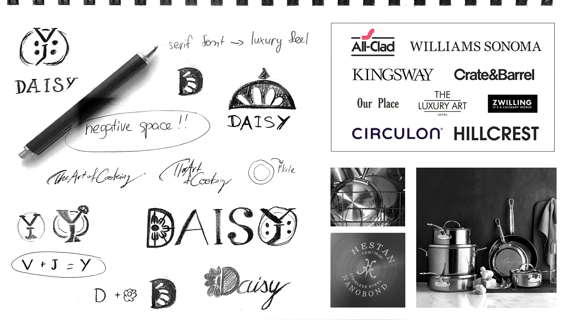
Mind Map & Sketches: Here are some of the ideas I came up with for the brand logo, based on the listed below brand characters. These ideas are gathered from my process of research about this industry and visualized in my head. After doing my research and listing down some ideas that I have, I start doing my sketches based on those ideas.

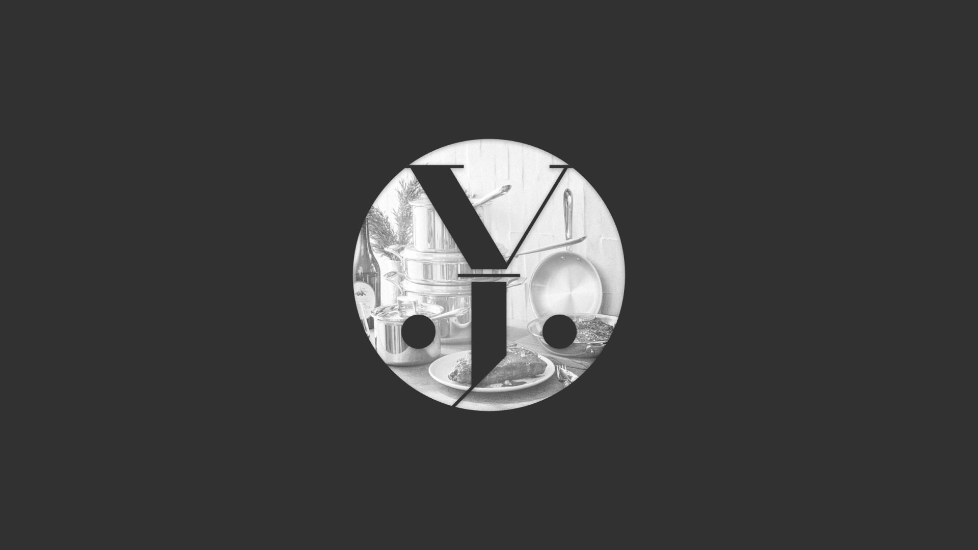
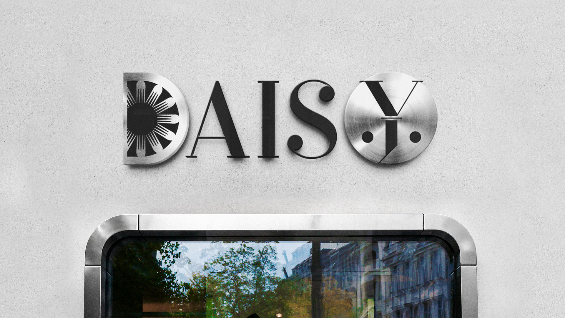
Final solution: The overall design of the Daisy logo is distinctive and memorable, ensuring it stands out in a crowded marketplace. Its combines the elements of luxury, professionalism, and a sense of culinary artistry. The logo communicates the promise of delivering high-quality, functional kitchenware that turn home cooking experience to an art. Classy, unique, sophisticated and impressive, the design are created to tell a whole story behind the brand at first glance.
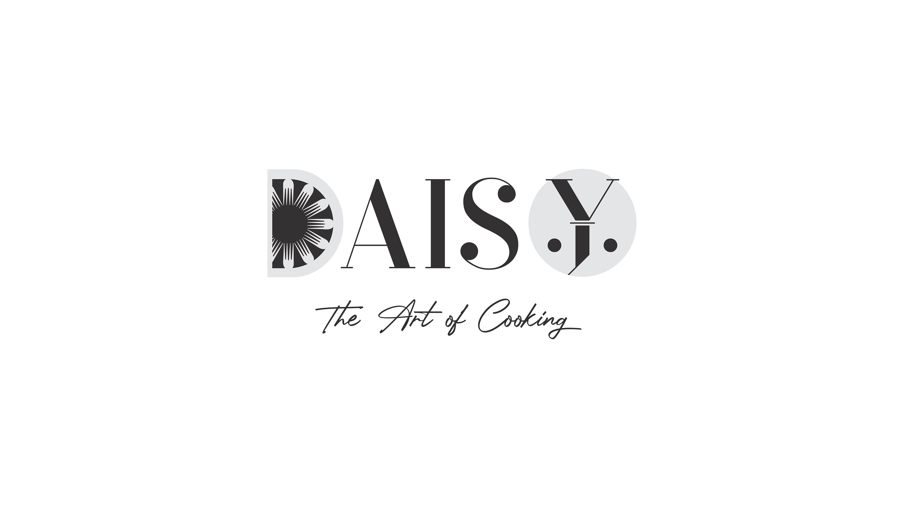
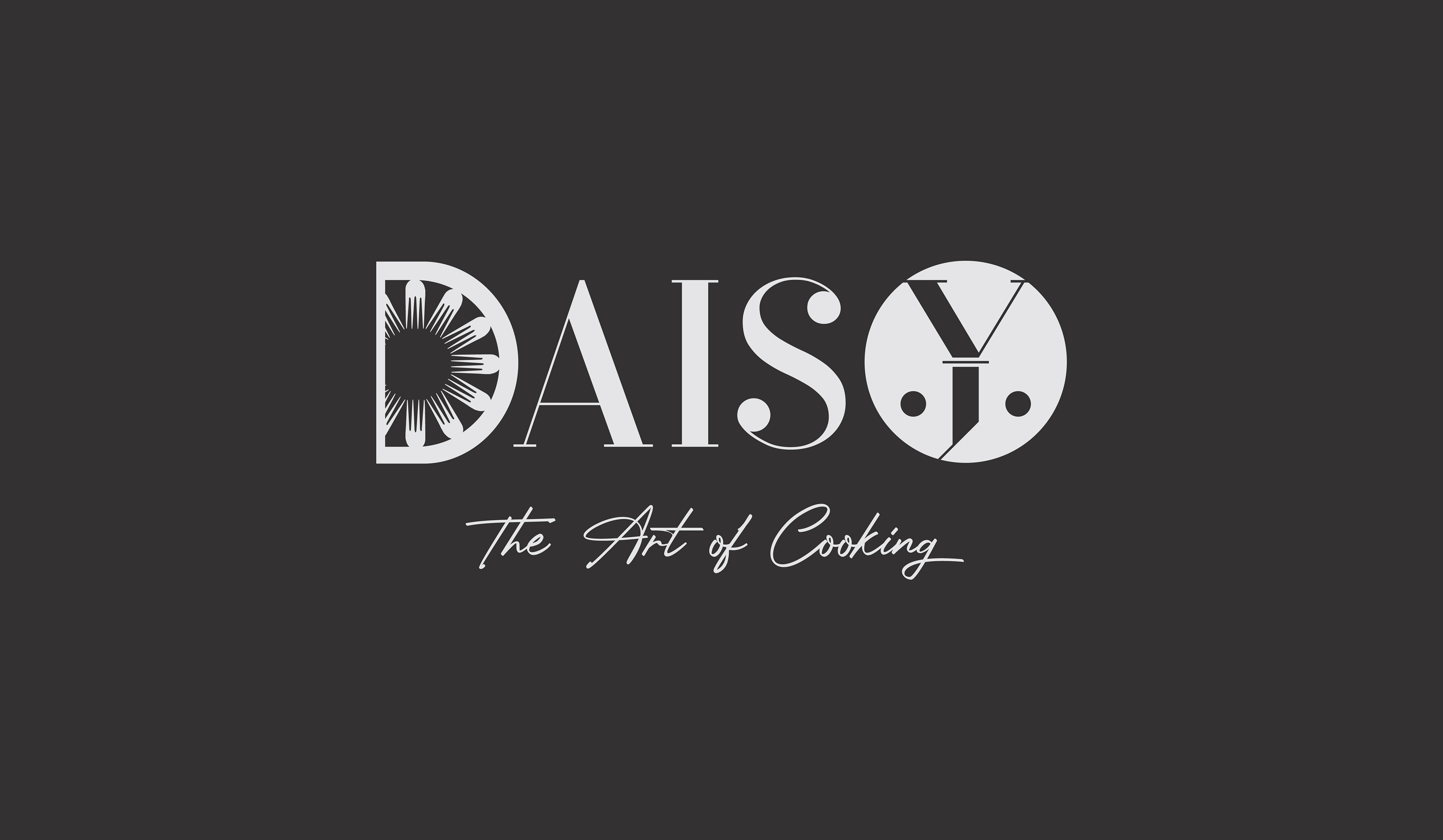

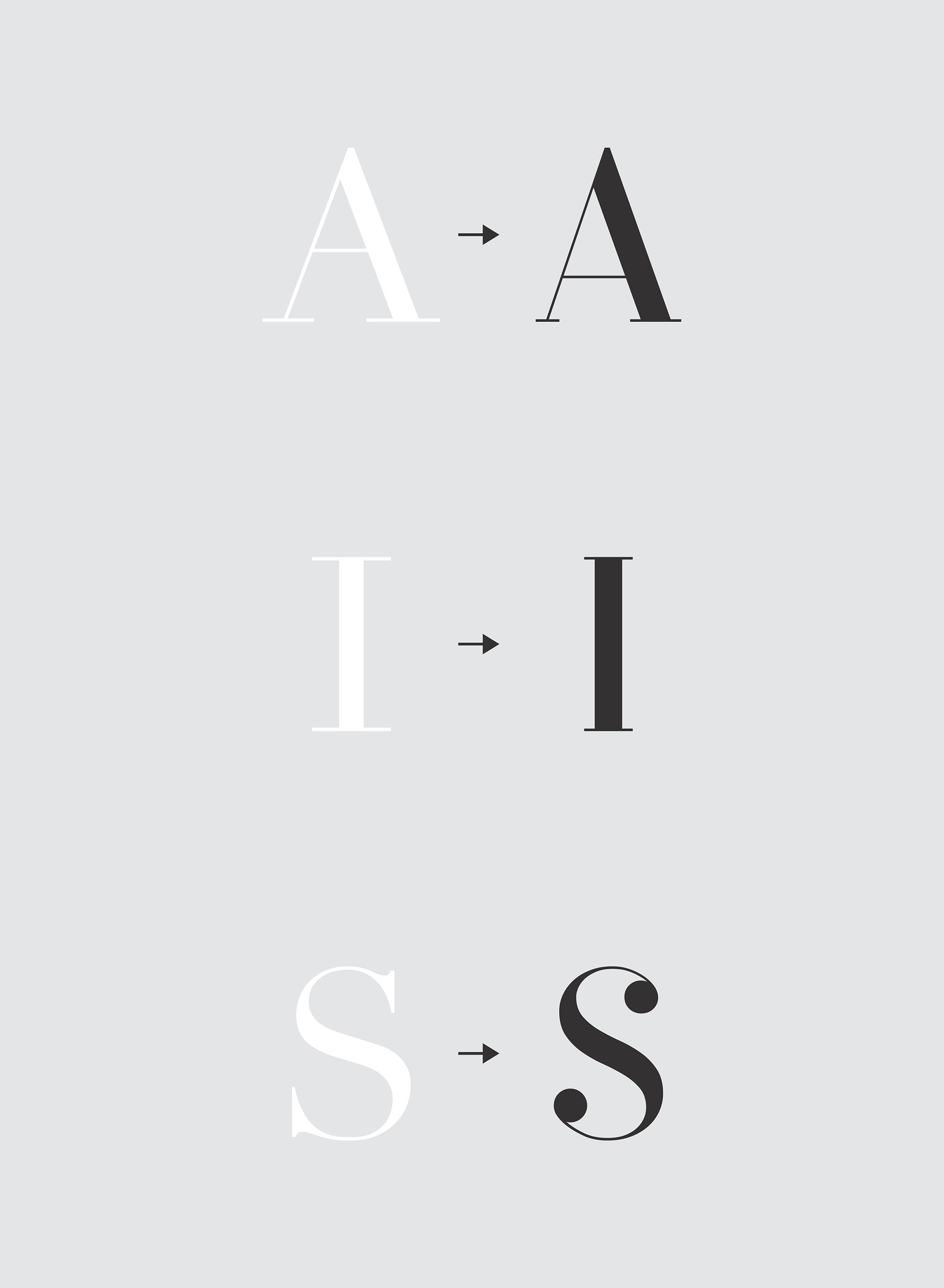
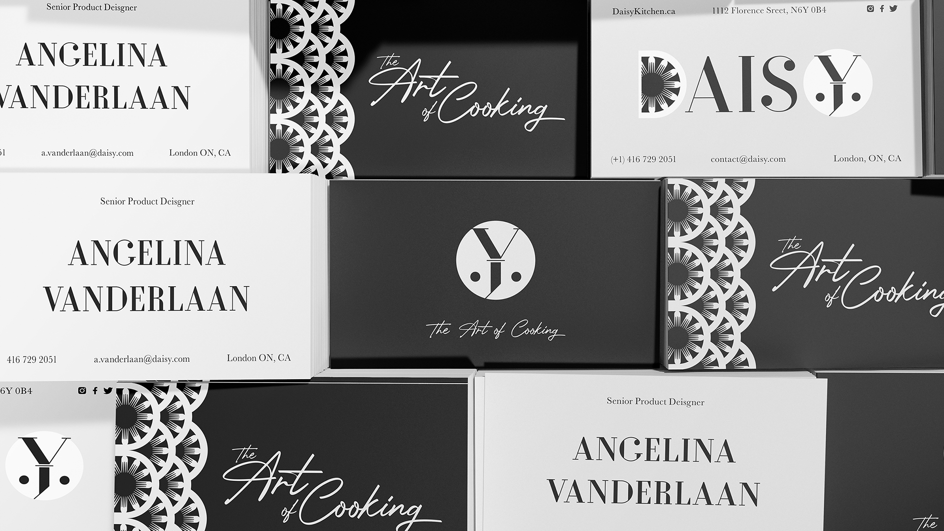
Typography & Color Choice: The chosen colors are the darker shade & the lighter shade of grey. This represent the full-clad feature of our brands' products, as well as promoting an elegant and luxurious feel to the brand. Since the logo is already very unique with a number of things going on, these color choice should balance out the visual effect. The original font choice is Didot, modified to soften the corners.


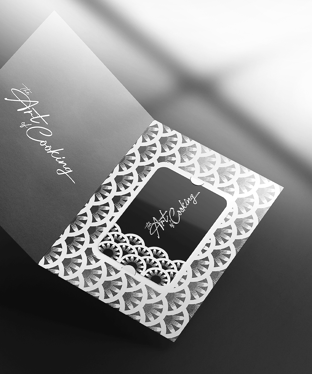
Secondary logo and branding elements: A logo is not branding. Branding is the whole system of synchronized designs from logo, colors, typefaces, taglines, patterns, etc. These designs are the appearance of the brand from head to toe, that plants a "gut feeling" inside the customers. Having those other items completely synchronized is always a good idea.


Website & Social Media: The website for Daisy is designed to be a place where culinary excellence meets artistic inspiration. Focusing on the brand's color guidelines of dark grey and light grey, the website refers to their premium full-clad materials products. Branding elements is injected throughout the website, bringing "Daisy" into every corner. Social media photos are also chosen carefully to bring out Daisy's values, such as cultural diversity, high quality, fun cooking experience, etc.

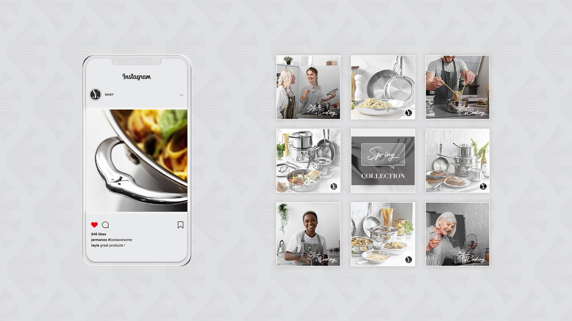
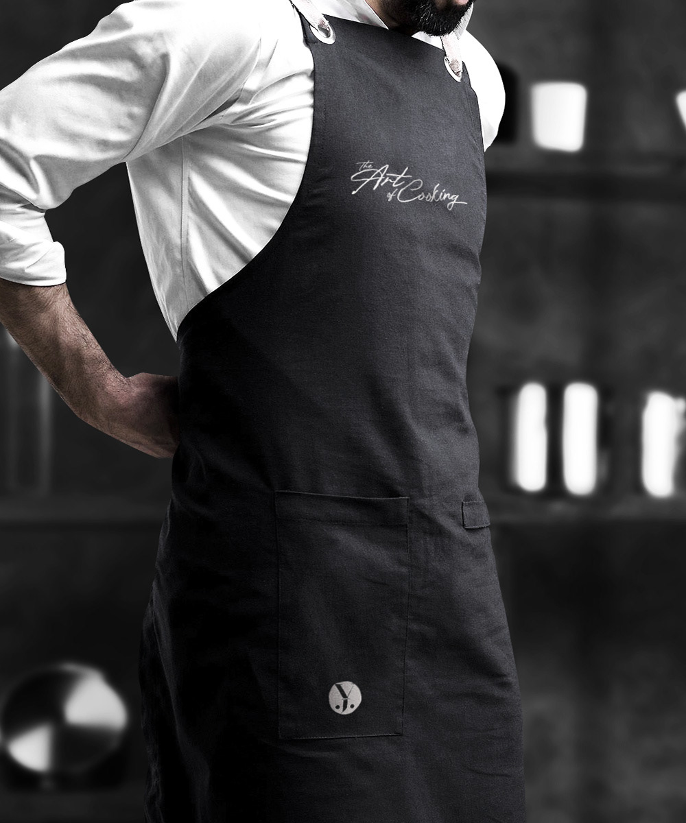
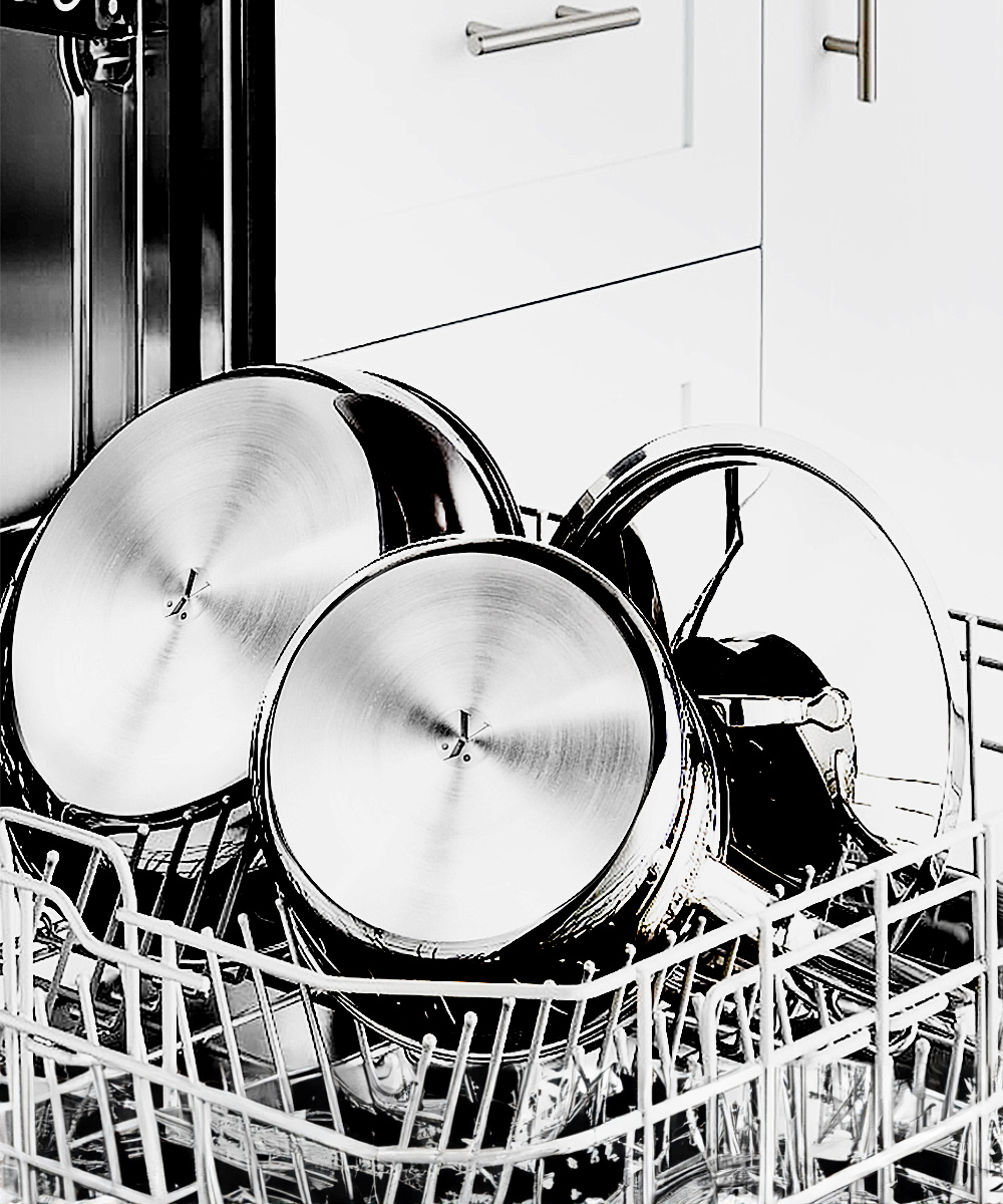
Marketing Assets: The designs focus on using of alternative logos on the products and other branding elements such as brand pattern to amplify the recognition of Daisy. As a new local brand on the market, creating a familiar sense to customers is the first step in the game.